

What makes a house a home? Love, family and the memories that are made there! These are the things that will always matter most but I have also learned over the past few years just how much ambience, specifically colours affect the mood and energy level of those residing in it. Here in the lower mainland BC where we get a LOT of rain during the winter and springs seasons, colours matter, something I wish I would have considered when we first bought our house 7 years ago.
Last week while prepping for this blog post I wrote a long piece about the house that I grew up in and how my own mother’s taste in home decor including the colour palette she decorated in influenced me for years after I left home. I wrote about how she also taught me through example about contentment and simplicity (mostly a good thing!) and how I never really took the time to look more deeply into what my own personal taste in interior decorating was until about 4 years ago.
I chose not to share all of the details of that original post because I felt like maybe the focus was too much on parental influence and finding ones creative self than was necessary for a before and after reveal post! Basically the short of it is that I finally realized 3.5 years ago, after completing Marcella’s nursery in a cool colour palette with white walls, that I had been decorating almost every room in warm tones by default and I didn’t even really like it anymore! I found that I responded to the nursery differently than any other space in our home. I wanted to spend so much more time there than anywhere else! In fact we all did!
I realized that many of the browns and beige, greens and reds that I continued to decorate with in the years after leaving home and even when we first married were purely what I had been used to and naturally gravitated towards. I also wasn’t very good at balancing the light to dark accent ratio either and truly just put a half effort into most of my decorating projects. I guess you could say, simply put, that I wasn’t very adventurous. When we first bought this house, I thought I was being bold by putting terracotta in the kitchen and beige everywhere else! (ahem, warm tones)
I need to make sure I acknowledge that there is absolutely nothing wrong with these colours. Though often cozy and relaxing they weren’t providing an ambience that helped me to feel energized and peaceful. This was probably because there was just too much of it in the whole house! The psychology of colour is really fascinating if you take the time to read up on it! (I’ll link to a few articles at the end.)
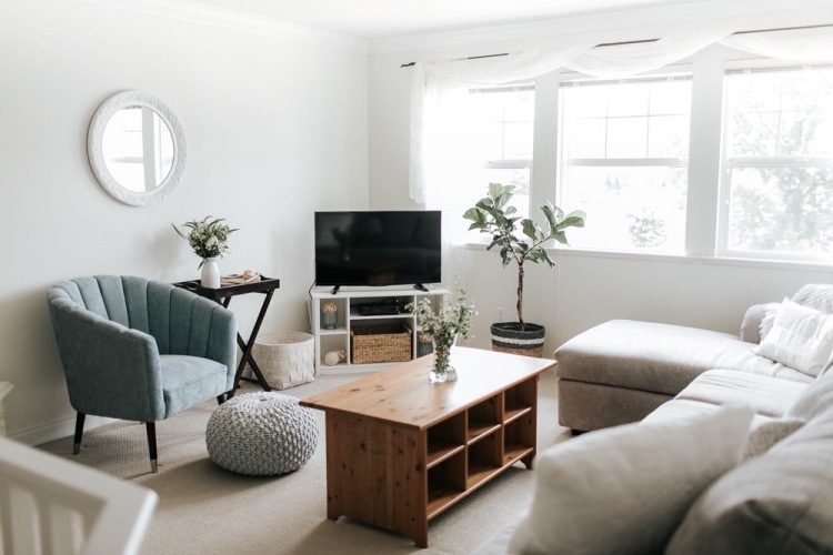
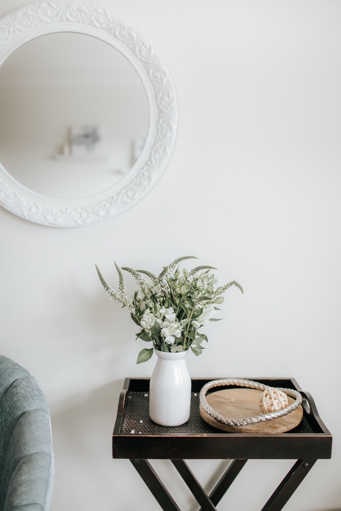
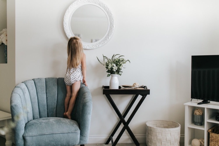
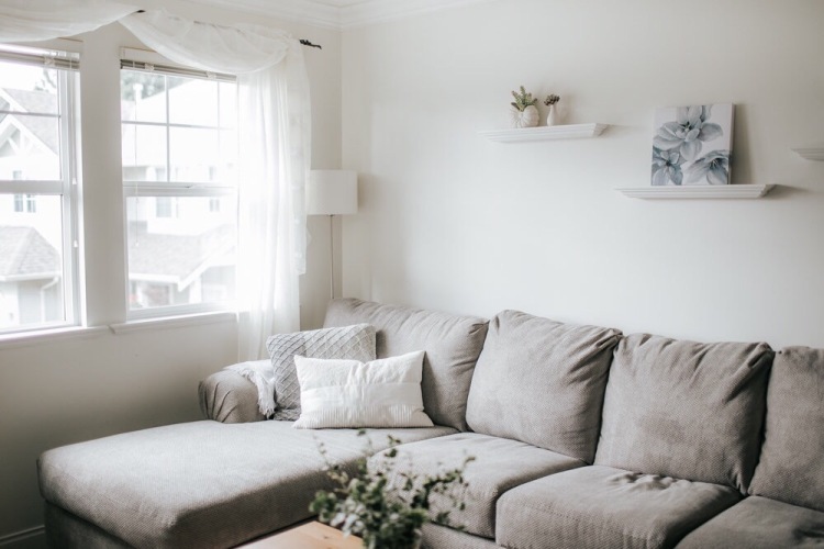
Sooo, moving on to Project Living Room! When we finally felt ready to get started, the first thing that we did, as you’ll see in the above slideshow, is paint all of the walls white! What a difference from one Christmas to the next! A few months later the corner tv unit was painted white and the chocolate brown furniture went to a new home just days before the new sectional arrived. As budget allowed the knit pouf, accent chair, cushions, wall hangings, lamp, mirror and a few other small decor pieces were purchased. All items will be linked to at the end!
I took my time (maybe a little too long) completing this room but am just so happy with how it turned out! I wanted a bright and cheerful ambience for this space and incorporated light blue/teal tones to compliment the grey and white that I’d been longing to see in this room for so long. Bringing in a large plant like our fiddle leaf and adding in some florals gave the room “life”. Even the faux succulents on the floating wall shelves contributed to that effect!
We absolutely love spending time in this room together as a family and and that chaise lounge in the corner by the window is my personal “happy place” where I enjoy snuggles and coffee most mornings. We brought up an “old” coffee table from our playroom downstairs last minute because the original coffee table paint job totally failed. We didn’t realize how NOT white our vintage white chalk paint was! ( I’d like to insert an embarrassed emoji here) but in the end all came together because the natural wood coffee table ended up being a really great fit!


Sectional: Leon’s Furniture
Knit 3 toned cushions: Homesense
White cushiom: IKEA
Lamp: IKEA
Coffee table: IKEA (Leksvik discontinued)
Wicker planter: IKEA (I painted the white stripe over the grey stripe)
Wall mirror: Homesense
Accent chair: Homesense
Floral wall prints: Homesense
Sheer curtains: Bed, Bath and Beyond
Wooden tray (on side table) Homesense
Colour psychology reads:
http://www.hgtv.com/remodel/interior-remodel/the-psychology-of-color
http://freshome.com/room-color-and-how-it-affects-your-mood/
Thanks for reading and sharing in this special reveal, a project that a lot of time and love was poured into! It feels so great to have this space, that I longed to work on for years, finally complete!
~Lynnelle

Lovey reveal Lynnelle,
What colour white did you choose and how on earth did you choose it? I will also be switching to whites and cooler tones and find the choices endless!
LikeLike
Thank you Karen! We love Benjamin Moore so I just went through their whites to find one on that was going to work throughout our whole upstairs. It’s called White dove. The colour of the tv stand is Oxford white. Hope that helps!
LikeLike
What a cozy living room!! Do you know the model name or number of the sectional from Leon’s?!
LikeLike
Thanks Darcie! It’s the Covina in Ash. We requested it in a custom configuration so it’s extra long. Check the website to see how it comes normally!
LikeLike
Very pretty room, light and neutral.
LikeLiked by 1 person
Thank you so much! It’s our favourite room in the house hands down!
LikeLike
Love this post 💕
LikeLiked by 1 person